I am not even supposed to be typing here, but I am too pissed off, too frustrated, which became can't-be-bothered to continue working on my report.
The most frustrating part of writing a lab report is when you find that after a long session of laborious excel data entry and operations, the outcome of your calculations serves to only tell you that your experimental results contain large amout of ERROR. And you know for sure your experimental data are problematic, because your theory confirms a trend for data that isn't quite the same trend you get after your calculations.
And then you think it might have arisen from poor Excel literacy, or personal errors, or systematic errors in Excel data entry, but when you've checked and double checked all the formulae in all the cells, the only conclusion you can draw is PROBLEMATIC EXPERIMENTAL DATA.
So, you panic.
Because this just isn't simply titration, where you can roughly work out the correct volumes. This, is a matter of an ARRAY of data, of which you have NO CLUES whatsoever where the error could possibly have arisen.
This is what I should have got:
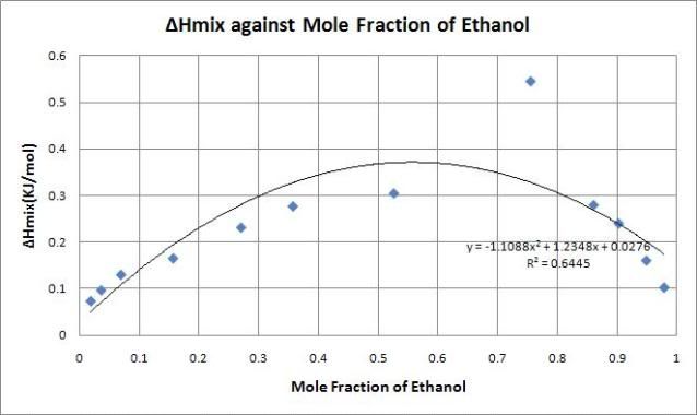
See how perfectly shaped the curve is? According to theory it should tend towards zero as mole fraction approaches both zero and one. But look what I've got:
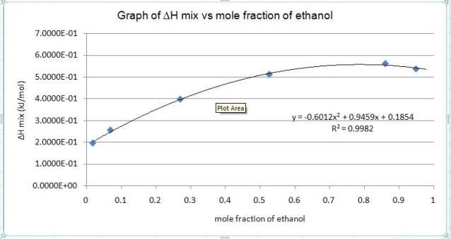
What a BEAUTIFUL quadratic curve! Awesome fit (R-square is 0.9982)! But it does NOT tend to zero at both extremes.
To make things worse, I selected TWELVE entries for Y, yet Excel stubbornly displayed SIX of them only. Yes, stubbornly, because no matter how many times I changed the scales, selected the data again and again, or even changed the chart type, it just insisted on displaying SIX out of the twelve. Why people's Excel so obedient but mine so OUTRAGEOUS!
Oh Excel how I hate you now.
